The elements below show potential solutions to specific goals and challenges with the envida website. They combine messaging and design to provide an overall sense of tone and style that will be used as a foundation for creating the rest of the website. Each section includes a brief description of what we’re trying to achieve.
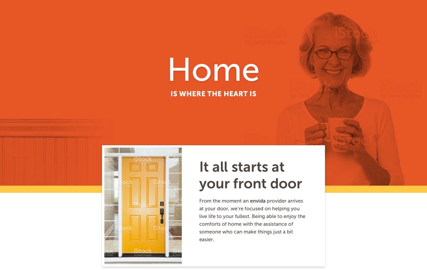
Whenever possible, show images of people living life and give a sense of their personality. In this example, the color, graphic, messaging, and even the color of the clothing all work together to create a clear picture.

Your lifestyle should be, too. At envida, we understand how important transportation and the comfort of your own home truly are to your happiness and health. That’s why we transport our clients to medical appointments, work and volunteer activities, classes, recreation activities and more. And we support your desire to stay where you’re most comfortable – home.
We want to make information as clear as possible while still infusing emotion. The messaging speaks to your audiences in a casual, yet straightforward way. The images create familiarity and focus on the little things that mean so much to people who want to stay in their homes. A clear hierarchy and small graphic touches help bring your eye down the page and link information together.

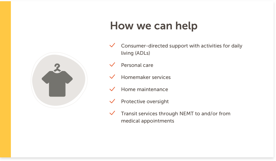
Checklists and other key information should be clear but don’t have to be boring. By adding additional context through icons and imagery, people browsing the page can find the information they’re looking for quickly. Notice the small ties of on-brand color, even in the image, that ensure consistency.
Bold titles and callouts alternate between questions and statements, engaging the reader and letting them know exactly what different sections of the page will be covering.

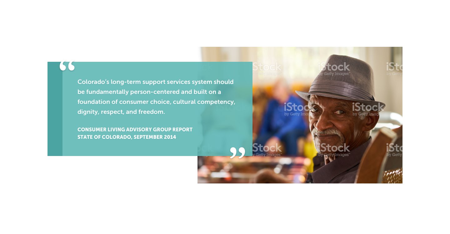
Testimonials and key statements work hand-in-hand with bold images that have a clear focus to create impact.
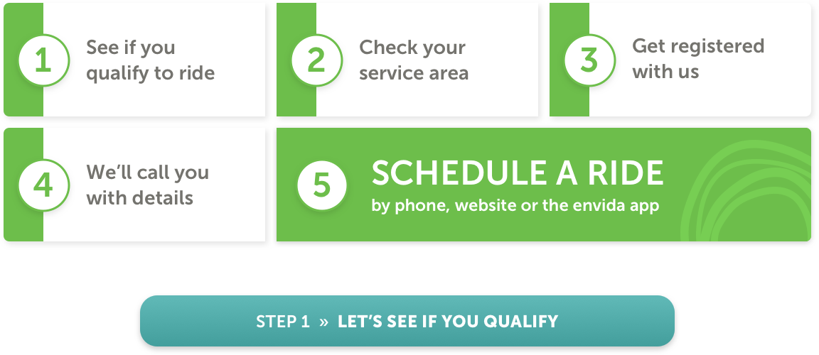
Processes are arranged so that you can always see the end-goal and every step would be clickable. A subtle sense of movement is created in the design and next steps will always be crystal clear.
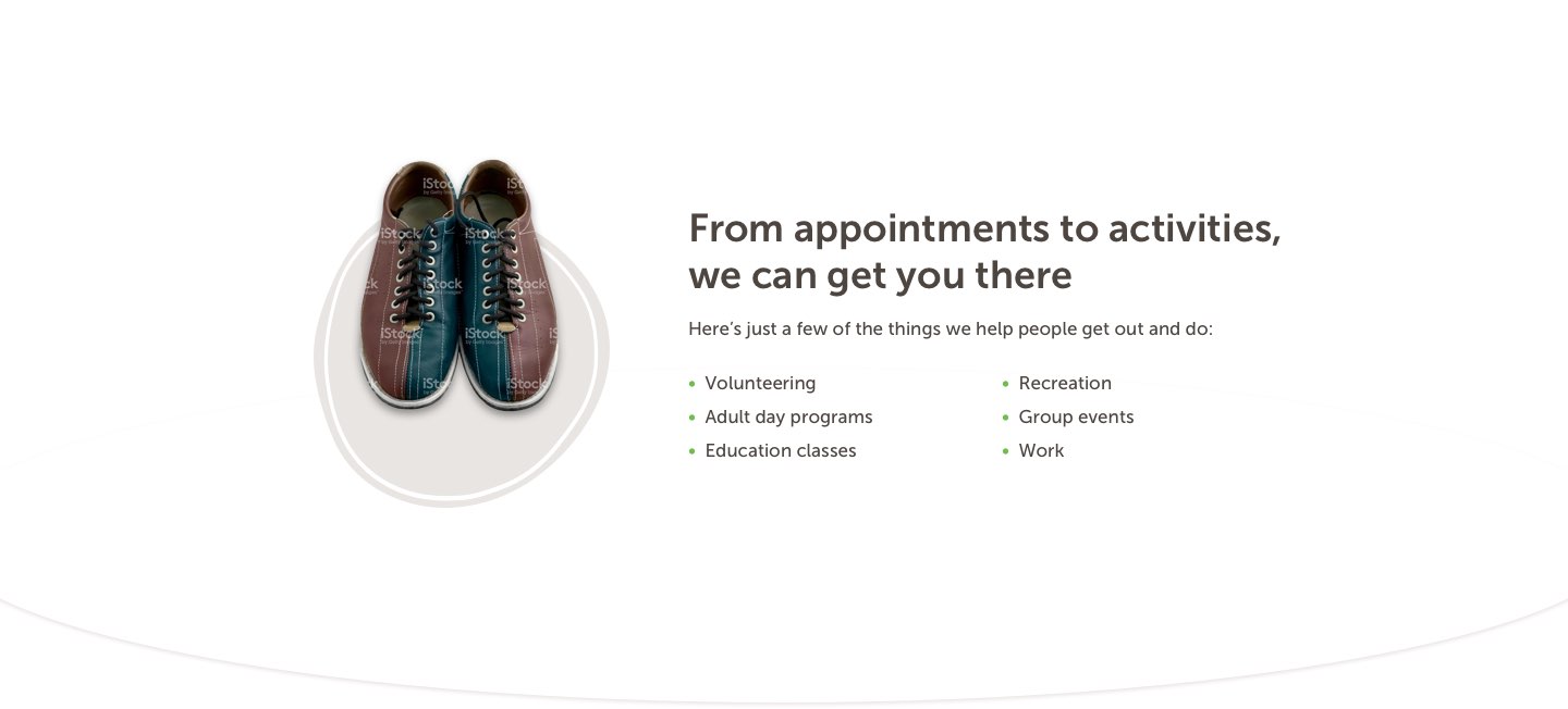
Instead of focusing only on the mundane (ie. picking up prescriptions), bring a bit of surprise-and-delight through small touches that remind people of the life they want to be living.
It will always be clear when someone should take an action and what that action should be. Large, clear buttons combined with messages and images that provide context help move people through the site.

The COVID-19 virus has impacted everyone. Here at envida, we have remained open as an essential transportation and homecare business, supporting our governor’s “stay at home” order and now “safer at home.” As restrictions begin to lift, we are taking every precaution to ensure our clients and riders are safe. Most importantly, we want to communicate to our riders that it is SAFE to RIDE.
Our drivers wear gloves and masks, and we request that riders have masks or scarves. We have installed antimicrobial film on interior bus surfaces that require a high degree of hygiene. We disinfect vehicles after each rider, and we will open windows for fresh air, weather permitting. We have expanded service hours to meet riders’ needs: We are open from 5 a.m. to 7 p.m. Our rural routes along U.S. Highway 24 and S.H. 94 have re-opened; the Calhan route operates Monday through Thursday, and the Ellicott/Yoder route operates Wednesdays and Fridays. We have also begun serving Teller County to help those with medical and behavioral health needs access healthcare providers in Colorado Springs.
For information about our transportation services, questions, or updates, please visit our transportation pages at www.envidacares.org or call our transit line at 719-633-4677.
Additionally, for our home care clients, we offer telehealth visits and our homecare attendants have been well versed on how to keep themselves and clients safe. For more information on telehealth visits, please call 719-301-6870.
We are closely monitoring the COVID-19 situation and will continue to take actions necessary to keep our clients, riders, staff and community safe and healthy. Any further updates will be posted here or you can call us at 719-633-4601. envida cares.